Not ABOUT ME / GUIDELINES / …
I’ve been obsessed with how data is visualised for years. In airports, when I flick through the pages of publications like the National Geographic, Time magazine, or The Harvard Business Journal, I am always drawn to their infographics. I’m blown away by how their brilliant designers contextualise information so concisely. In our studio we are often asked to synopsise quite complex data in easy to decipher summaries and I’ve leaned heavily on the knowledge I‘ve picked up from these visual data wizards. Below is collection of the various ways you can execute data visually.
Visualising
Data
How to Design with Numbers
DEVIATION
Solution: Spine Chart
Emphasis variations from a fixed point. Splits a single value into two contrasting components. Shows sentiment.
CHANGE OVER TIME
Solution: Area Chart
Highlights changing trends. Time period selection is important to provide audience with context.
MAGNITUDE
Solution: Isotype Chart
Size Comparisons. Usually shows a counted number rather than a %.
SPATIAL
Solution: Basic Choropleth
Geographical patterns or locations
RANKING
Solution: Ordered Bars
Simple Hierarchy. An item’s position in a ordered list is more important than its absolute or relative value.
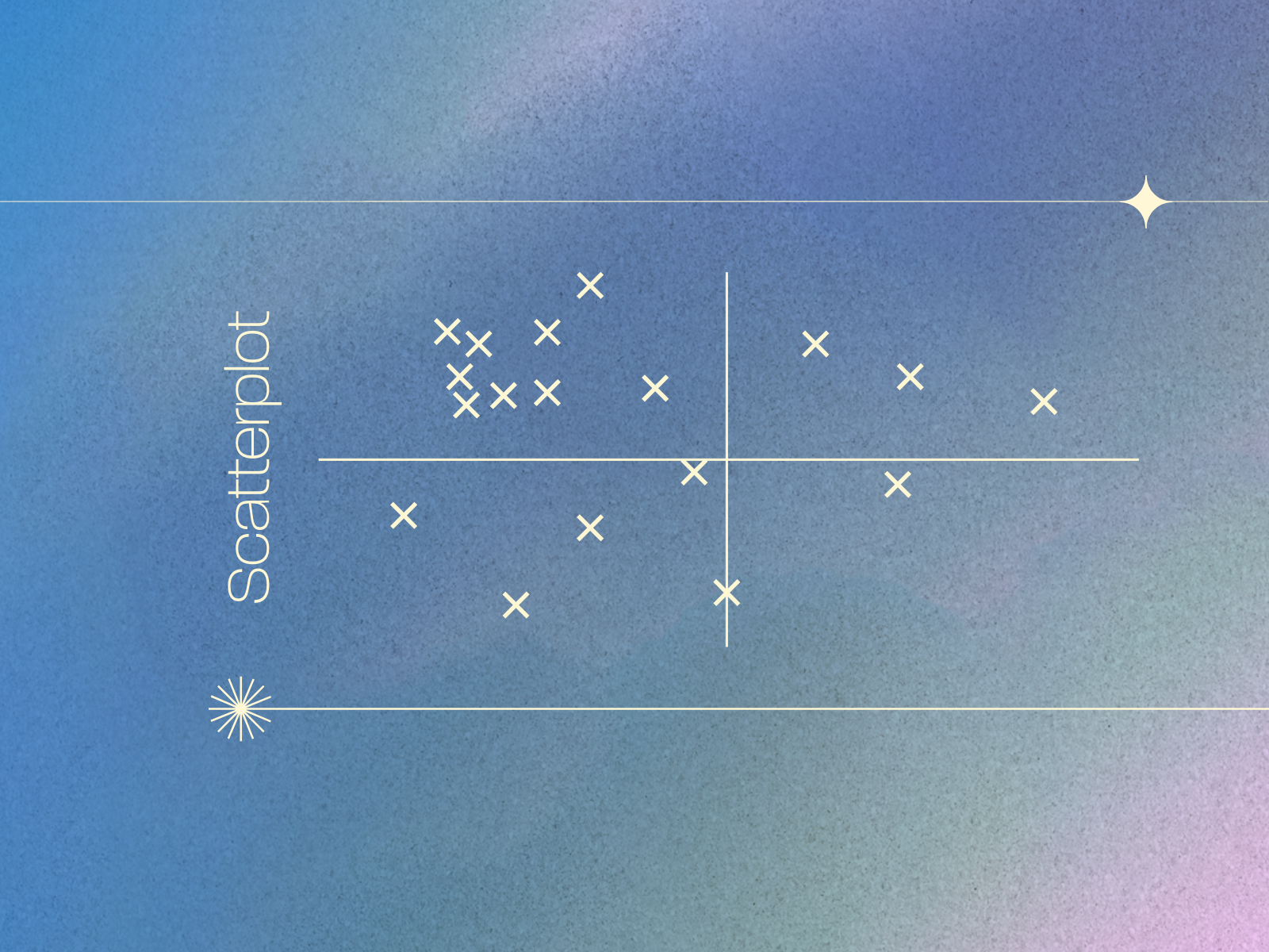
CORRELATION
Solution: Scatterplot
The Relationship between variables. Ideal for displaying the positive correlation, negative correlation or no correlation.
DISTRIBUTION
Solution: Boxplot Graph
Datasheet of value frequency. The shape of a distribution can highlight the lack of uniformity or equality in data.
FLOW
Solution: Sankey Graph
Volumes or intensity of movement. Logical sequences or geographical locations
PART-TO-WHOLE
Solution: Ordered Bars
A segmented single entity. A composition of size and proportion.


